Pick your style from what the story needs: its mood, shapes that read clearly, your line and tone, and the amount of detail you can repeat across a sequence of panels. A shōnen or shōjo label won't choose it for you, and neither will one portrait you admire. Draw the same character in a close-up, a wide shot and a dialogue panel, then compare. If the look turns unclear, inconsistent or too slow, simplify the rules.
What makes an art style look like manga?
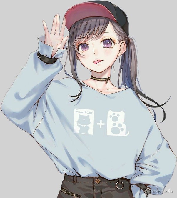
Manga is Japanese comics. Art influenced by manga draws on a wide range of conventions. Black-and-white pages, speed lines, expressive symbols and the original right-to-left reading order are the usual ones. Across a run of pages, your style has to keep recurring characters recognizable and each move between panels easy to follow.
Shōnen, shōjo, seinen and josei describe readerships
Shōnen, shōjo, seinen and josei traditionally describe intended readerships in manga publishing. Within each category, creators make their own choices about proportions, inking, expression and composition, and readers enjoy works outside the demographic a title was written for.
| Label | What it describes | Artistic choices left open |
|---|---|---|
| Shōnen | Boys' readership | Character proportions, line work, atmosphere |
| Shōjo | Girls' readership | Expression, shading, composition |
| Seinen | Adult male readership | Realism, level of detail, how dark the tones are |
| Josei | Adult female readership | Facial design, rendering, story genre |
| Action, romance, horror | Story genres | Proportions, marks, inking and color choices |
| Chibi, heavy inking, screentone | Visual techniques | Reader demographic and story category |
VIZ Media's manga FAQ covers shōnen and shōjo from the publisher's side. A romance aimed at adults, for example, can use sparse outlines or dense hatching and stay a romance.
Neil Cohn and Sean Ehly categorized 73 conventionalized graphic schemas in a study published in Journal of Pragmatics in January 2016. They then examined how often those schemas occur in a corpus of 20 manga books: ten shōnen and ten shōjo. Many schemas appeared in both groups, and some devices were used more in one than the other.
The study compared only shōnen and shōjo and gives no formula that fits every manga. The Cohn and Ehly paper examines graphic conventions, including visual signs that convey states or emotions.
A creator on r/Mangamakers, influenced by Fullmetal Alchemist and now interested in Berserk, asked, “so which art style is suitable for an adult manga?” That is a decision about the effect you want, and no audience label prescribes the level of realism or detail.
Treat “seinen style” or “shōjo style” as an audience label, then name the visual feature you mean, such as sparse outlines or densely shaded environments.
The visual choices that change a manga drawing
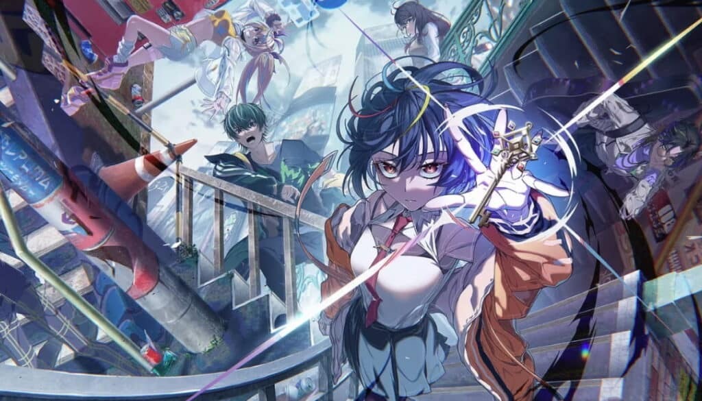
A manga drawing looks different when you change its shapes, line weight, light and dark areas, texture, expressions or framing. The useful question is which marks change the viewer's focus and which only fill space.
A rounded silhouette gives the eye a broad, uncomplicated form. Angular forms add sharper directional accents.
| Feature | What visibly changes | Effect |
|---|---|---|
| Shape and proportion | Rounded or angular outlines, simple or detailed figures | Silhouettes you can tell apart, and how simplified the drawing is |
| Contour and line weight | Fine, uniform or selectively heavy strokes | Separation, emphasis, energy |
| Black-and-white values | Open whites, solid black areas, shifts between tones | Main focus and atmosphere |
| Texture and tone | Hatching, cross-hatching, patterned screentones | Surface detail and in-between tones |
| Expressive devices | Exaggerated faces, symbolic marks, speed marks | Clearer emotion or action |
| Framing | Cropping, where the subject sits, how much space the image gives it | Attention and story emphasis |
A thick outline around the foreground face gives it priority. Put the same weight on every edge and the emphasis weakens.
Ink, tone, and expressive shorthand
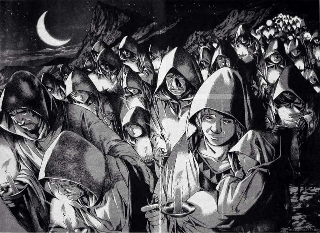
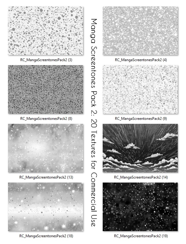
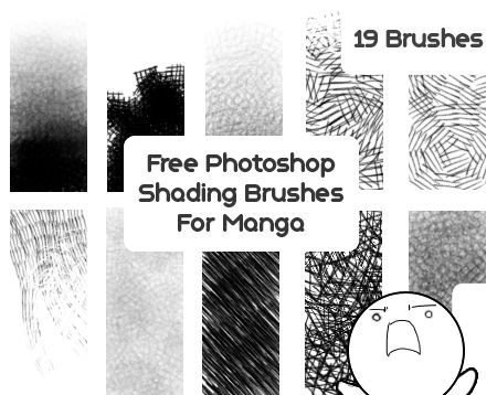
Solid blacks help organize a monochrome page. Hatching uses repeated lines for value or texture, and cross-hatching adds intersecting marks. Screentones use patterned marks to produce tonal areas.
The Clip Studio Paint screentone manual lists four controls: frequency, density, angle and pattern. The final print or screen size changes how the pattern looks.
Graphic shorthand carries meanings beyond facial anatomy. A stylized sleep bubble is one such sign, and the scene around it tells the reader what it means.
Framing matters, too. Manga scholar Natsume Fusanosuke discusses how panel divisions organize time and expressive space. A close-up directs attention differently from a room-wide view, even when the character design stays the same.
Four ways to draw the same manga scene
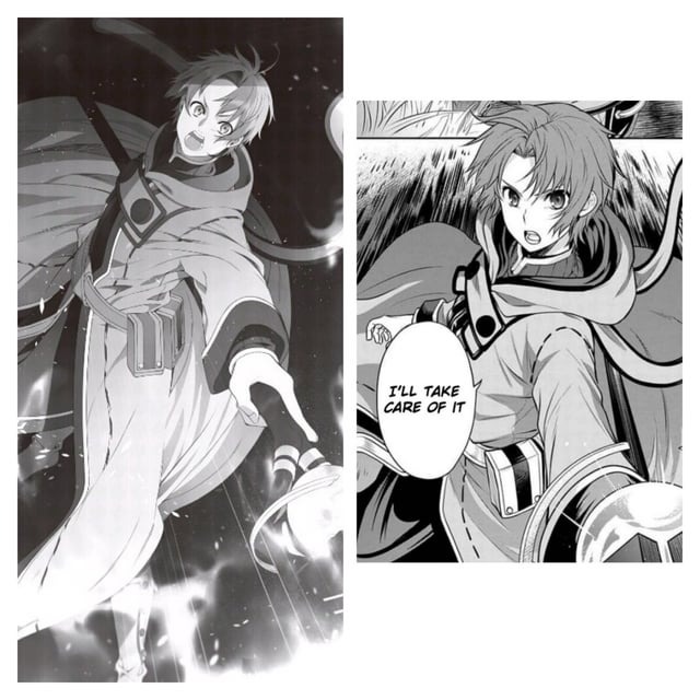
An original character turns toward an unexpected sound in a small room. Only the marks and the light and dark areas change between the four versions. The character, action, pose, camera angle, crop, background layout and story beat stay fixed.
| Version | What changes | Story use | Main cost or weakness | Comparison check |
|---|---|---|---|---|
| Clean graphic | Few lines inside shapes, a light even outline, large white areas, little tone | A turn or reaction the reader gets at once | Less surface texture | Does the turn read from silhouette and placement alone? |
| High-contrast expressive | Heavy strokes on the outer edges, larger black masses, marks pointing toward the disturbance | A sharper sense of alarm or threat | Dark shapes bury small details | Can you still separate the face from the source of attention? |
| Soft atmospheric | Fine outlines, open space, few midtones, gentle tonal transitions | A quiet or uneasy pause | Similar neighboring tones blur the main focus | Does the character stay distinct from the room? |
| Dense textured | Cross-hatching, varied strokes, patterned tones, detailed surfaces | A richly described or oppressive setting | More repeated work and visual clutter | What detail disappears at final reading size? |
If heavy blacks overpower the character's face, reduce the competing dark shapes. If gentle shading weakens separation, make the difference between the figure and the background clearer.
Choose a look that fits your story and workload
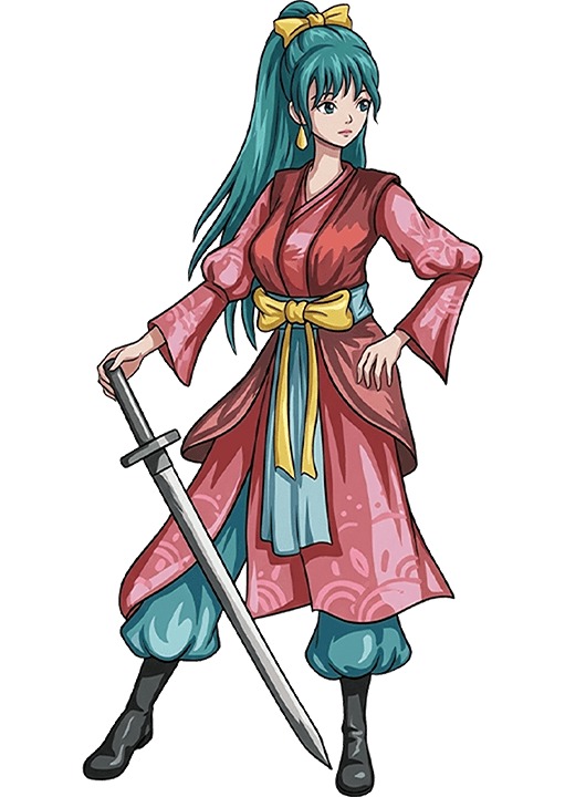
A held silence, an abrupt threat and a playful reaction each draw the eye to different parts of the drawing. Your style also has to hold up beyond one polished illustration.
- Readability: Faces, important objects and big shapes stay clear at the size readers will see.
- Continuity: You can draw recurring characters and locations by shared rules and keep them recognizable.
- Production capacity: You can repeat the amount of shading within the time the project allows.
High detail enriches clothing, materials and atmosphere, and it adds repeated drawing work. A simpler version leaves more room for the scenes that matter. The Clip Studio Paint guide to developing a comic art style recommends estimating the work involved in a representative episode and adjusting complexity or plans when the effort becomes unsustainable.
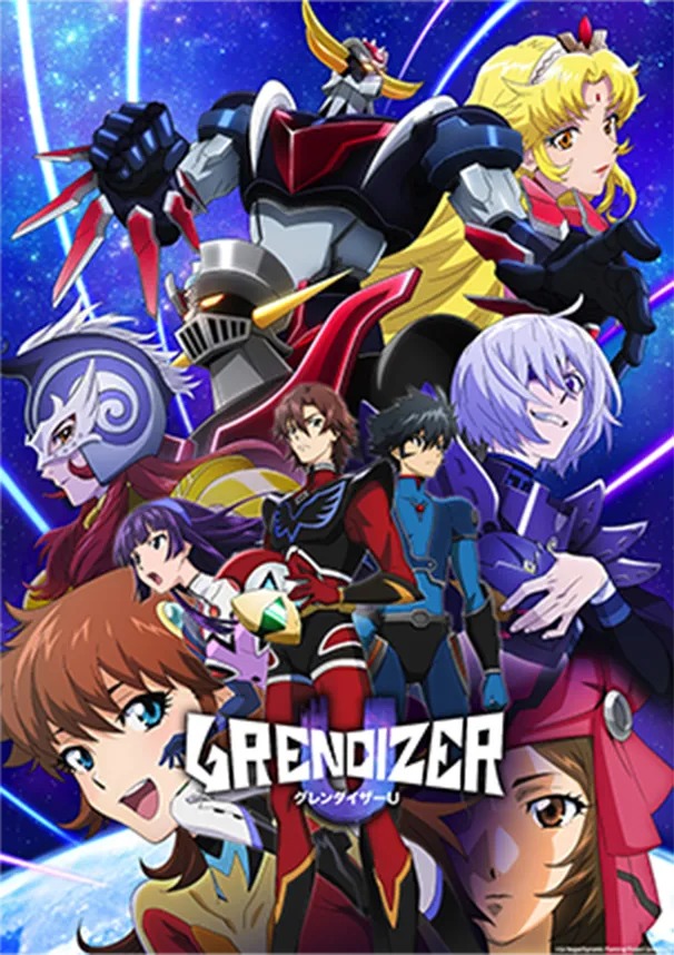
No set number of hours makes a style sustainable. Your tools, experience, page complexity and release pace decide.
A solo artist making a monochrome mystery with frequent interiors reserves dense blacks for moments of tension and keeps routine scenes restrained. The contrast belongs to this project, and the artist's own style can keep changing.
One artist on r/ArtistLounge put it this way: “I sometimes will pick stylistic elements for certain projects, but never for myself as a whole.”
Write a one-sentence criterion that joins the desired effect to a concrete capacity limit: I want quiet, uneasy interiors in a monochrome comic I can draw alone, using clear silhouettes and selective background detail.
Study manga artists’ techniques for your own work
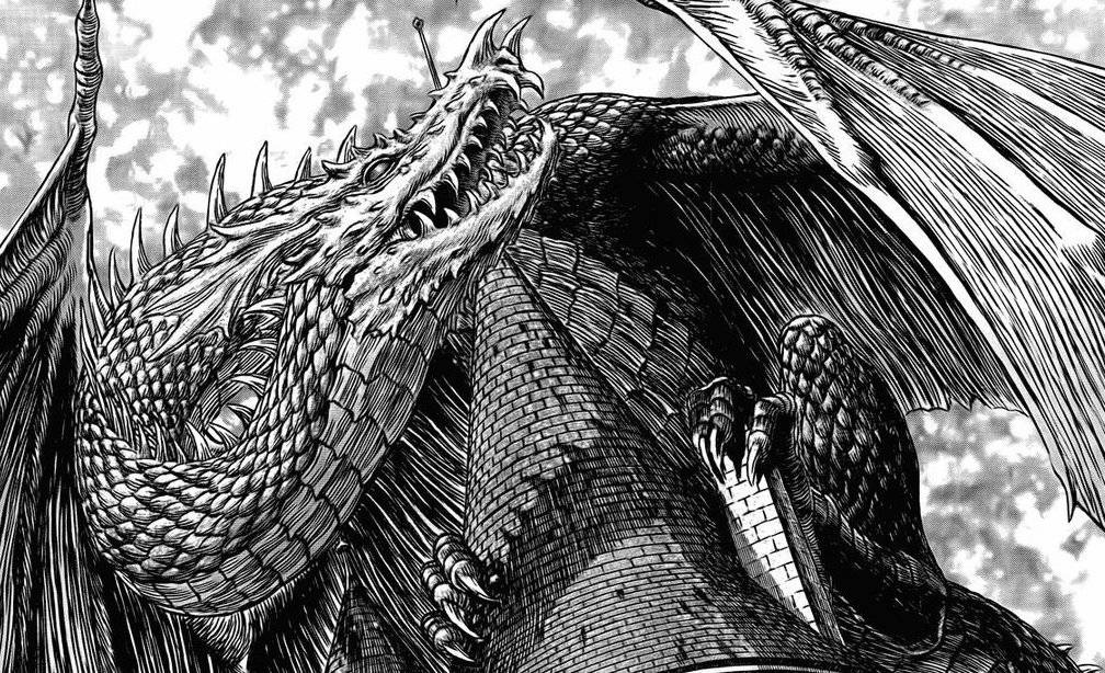
When you study an artist you admire, look at specific choices: outline, black-and-white organization, construction, expression and composition.
In a feedback request on r/Mangamakers, a creator wrote, “Fujimoto is my #1 inspo but i dont wanna come off as a fujimoto clone which is what im worried abt.”
Make a three-entry influence note, drawing on different references. Give each entry a visible feature, its intended function and a specific use in an original character or composition:
- Contour: Look at where a reference thickens its outlines, then decide which edge of your original character needs more emphasis.
- Value: Study how another image separates figures from backgrounds with black-and-white areas, then specify the main contrast you want in your own scene.
- Expression or framing: Notice how a reference communicates a reaction through simplification or cropping, then adapt that goal to a new moment in your story.
Turn each entry into a rule that says where it applies, for example “heavy outside contour only around the nearest figure.” Then see whether the three rules work together.
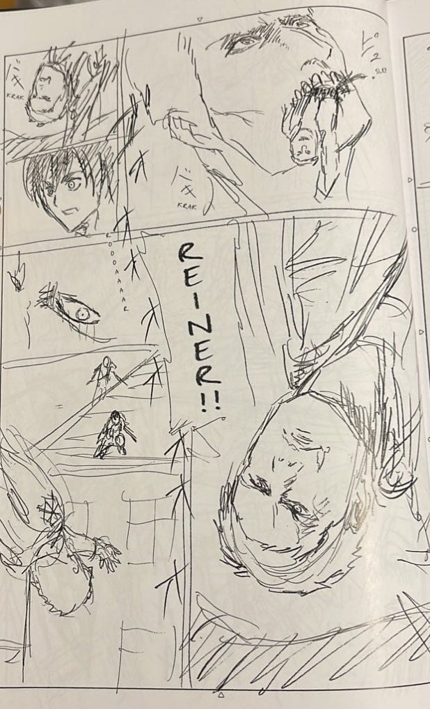
Private drawing studies and artwork made for publication use a reference differently. Learning a technique builds your skill. Reproducing or distributing protected images raises rights questions, including whether fair use applies.
Watch for choices that clash. Very detailed figures with very simplified faces look disjointed, unless the character design has a coherent reason for the shift.
Keep your characters in the same visual world

Different characters can still look like they belong to one comic. Silhouettes, features, proportions and clothing make each one individual. Shared construction, outline weight, tones and expressive shorthand tie them together.
One r/Mangamakers artist described the problem: “I have the feeling that my characters dont feel like they’re from the same manga.”
A tall angular figure and a short rounded figure can share a story while using the same method for weighting outlines and organizing shadows.
| Rule category | Example shared rule | What can vary by character | Sign of unwanted drift |
|---|---|---|---|
| Head construction | Place features on the head the same way every time | Face shape, nose, eye proportions | Features shift without a change in viewpoint or expression |
| Contour | Thin inner marks with weighted outer edges | Silhouette, hair, clothing | One figure follows different line rules |
| Blacks and tones | The same logic for shadow masses and tonal density | Clothing tone, local texture | Similar lighting gets different tones |
| Expressions | Shared range of symbolic exaggeration | Temperament, habitual expression | A reaction loses the character's identifying features |
| Background treatment | Comparable detail hierarchy and spatial drawing | Settings, objects, atmosphere | A recurring location's drawing rules change for no reason |
Fill in the shared-rule column for your cast and name at least two features that should differ between characters. The sheet guides future drawings. Each character's model sheet records that design's own construction details.
Test the style before you commit to a chapter
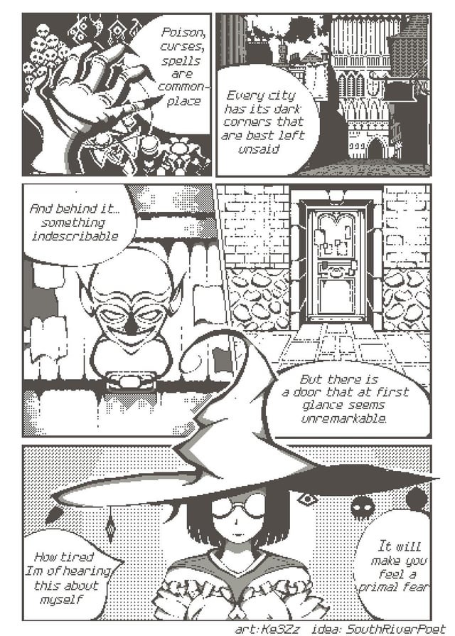
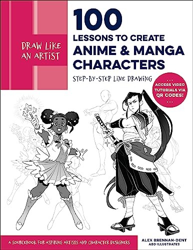
A polished portrait shows one carefully chosen view. A short sequence tests the same style under different demands: a face filling the frame, a figure surrounded by space, and an exchange that has to leave room for lettering.
Use one original character for three panels:
- Close-up: Draw the face and its expression using your chosen construction, outline and tone rules. Watch whether the features that establish identity change.
- Wide shot: Put the character in an environment. The silhouette has to stay recognizable when facial details take up less of the image.
- Dialogue panel: Show the character speaking or listening and leave readable room for text. The facial acting and the shading should support the exchange.
Inspect the trial at the intended reading size: a comparable phone display for a mobile comic or the planned printed scale for a page. Fine hatching and dense tones that look good magnified merge into competing tones when reduced.
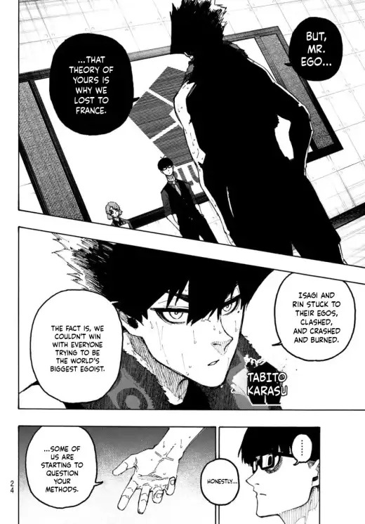
Have someone unfamiliar with your design pick out the recurring character across the three panels. Then see whether the focal object's edges survive next to the blacks and tones around them.
Record your own production time for the sequence and compare it with the amount of drawing your schedule would require.
When a panel fails, make the smallest relevant revision:
- Unclear focal action: Separate important silhouettes and simplify competing dark areas.
- Unstable character identity: Correct the head or body construction and preserve identifying details across views.
- Excessive finishing effort: Remove repeated textures and marks that add little to legibility or atmosphere.