If you're lettering original manga in English, place balloons in the page's reading order, make every speaker identifiable, and keep normal dialogue legible with breathing room. If the words can't fit at that size, edit or split the exchange before shrinking the type. Then proof the page at its actual reading size.
Plan the reading order before you draw the balloons
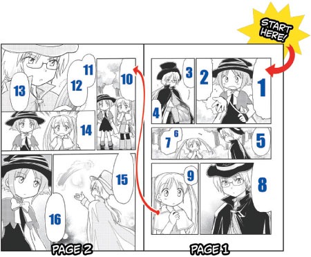
The reading order decides where the reader looks first, how the eye moves between speakers, and where the dialogue needs space on the page.
Japanese manga traditionally reads from right to left, as publisher VIZ explains. Original English-language manga can also read left to right. Choose the direction before you arrange dialogue, then keep it consistent across the page.
In a doorway scene with two characters, A asks about a noise, B describes footsteps, and A warns B to stay put. On a right-to-left page, the first balloon goes in the upper-right part of the reading area. The reply sits lower and to the left. On a left-to-right page, reverse the horizontal direction.
On a rough page, number the three beats and reserve loose balloon shapes before you fill the space with faces, gestures, and scenery. The nearest character doesn't always speak first.
A commenter in r/Mangamakers wrote, “One thing I might add is that I recommend adding the speech bubble at the same time as the sketch.” A rough balloon moves freely while the drawing takes shape.
The gap between panels is the gutter. A balloon near it affects whether the reader finishes a conversation or moves on to the next panel.
Make it instantly clear who is speaking
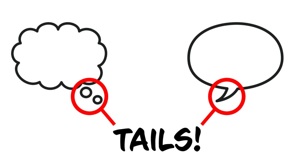
A speech balloon, also called a speech bubble, needs a clear link to its speaker. In conventional lettering, that link is the tail, the pointed extension that shows who is talking.
For a visible speaker, the tail points at the head or mouth area. You can stylize its angle, but it shouldn't seem to give the line to another character.
A stands on the left and B on the right, and B's balloon sits between them, with its tail crossing toward A's shoulder. The words read as B's reply, but the tail sends the reader to A. Move the balloon next to B and point the tail at B. The line now clearly belongs to B, and the reading order stays the same.
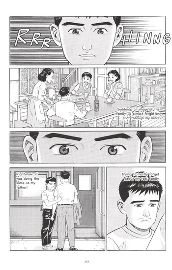
A voice from outside the panel is different. The speaker may have no visible face to point at, so you can use an off-panel cue or another treatment the context makes clear. Deliberate uncertainty about the speaker can also suit a scene.
Choose balloon shapes for speech, thoughts, and emphasis
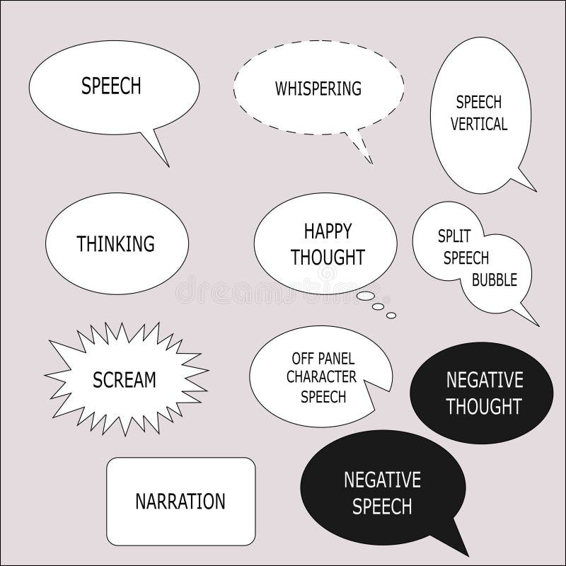
Conventions vary a little between artists and publishers, but these shapes are familiar to most readers:
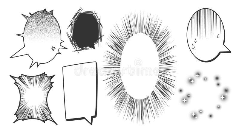
- Rounded balloon: ordinary speech.
- Cloud shape or linked small bubbles: thought.
- Jagged outline: a shout.
- Lighter or dashed outline: a whisper.
- Caption: narration or a scene transition with no named speaker, such as “An hour later.”
- Sound effect: graphic text inside the artwork, such as “THUD.”
Label each line in the doorway scene as speech, thought, shout, whisper, or caption. Save the expressive shapes for lines whose delivery changes.
Letter the dialogue so it fits and stays readable
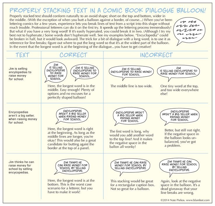
Typeface, text size, line breaks, line spacing, and distance from the outline all decide how easily dialogue reads.
For a line that fits normally, start with the words in your base text style. Arrange them into a compact, balanced block, then draw or resize the balloon around that block so the letters have room on every side. Center the text in the shape and keep the tail aligned with the speaker. This text-first method works whether you draw the outline by hand or adjust it with a digital tool.
The empty space between lettering and outline is internal padding. Blambot and TO Comix Press both stress consistent treatment and keeping letters clear of the balloon edge.
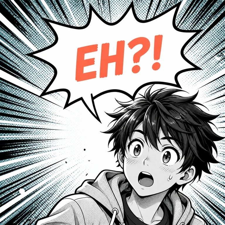
The line “I heard something near the stairs.” can be lettered two ways. In one version, the final word presses against the border and the rows sit tight. In the other, the words and base size stay the same, but new line breaks and a reshaped outline leave balanced space. The arrangement does the work, and the font size stays put.
Keep ordinary dialogue at a consistent visual size across a page. A line squeezed smaller sends an unintended signal, while a deliberate whisper or shout can look different. Keep letters distinct from the background and from any art that crosses the balloon.
No single font size or padding measurement fits every typeface, print trim, and digital screen. If a line still overwhelms the balloon, use the correction process below.
Fix crowded, confusing, or obstructive speech bubbles
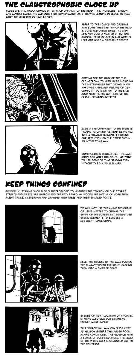
A balloon can hold legible words and still interrupt a conversation, cover an expression, or seem to belong to the wrong speaker. Work out what's wrong first, then fix only that.
| Visible problem | Cause | Fix |
|---|---|---|
| Reply appears before the question | Balloon order doesn't match the reading path | Reorder the balloons to follow the beats |
| Line seems to belong to the wrong character | Ambiguous position or tail, such as a tail that crosses another face or ends between two people | Redirect the tail and move the balloon closer to the speaker |
| Letters press against the outline | Too little padding or poor line breaks | Rebalance the lines and resize the balloon |
| Balloon covers a face or key action | Dialogue competes with essential artwork | Move the balloon or rethink the composition |
| Normal dialogue becomes much smaller | Too many words for the available space | Edit or split the exchange before shrinking the type |
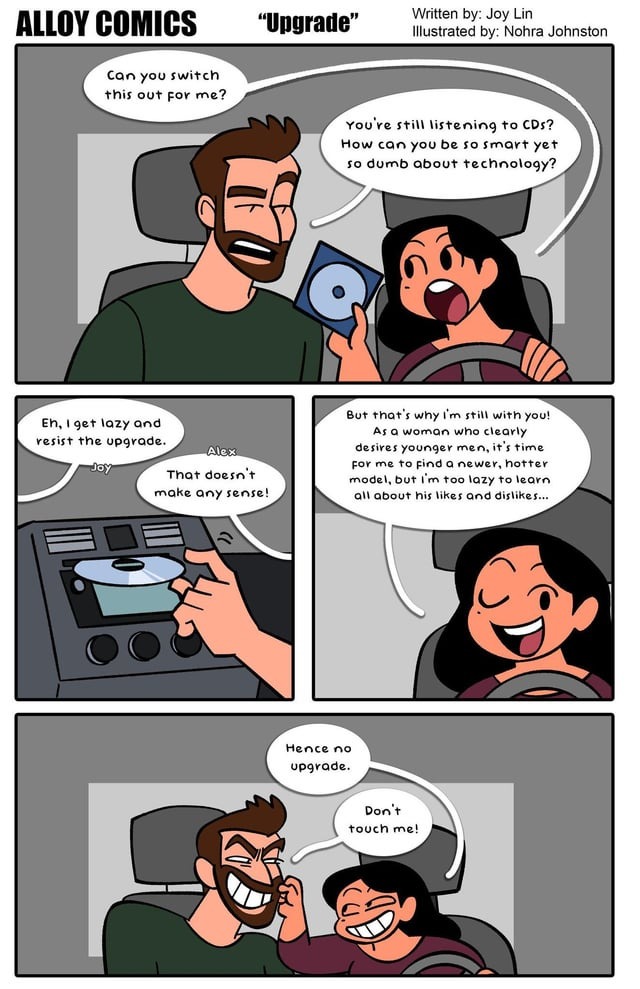
Every fix has a trade-off. Moving a balloon can uncover a face and break the reading order. Enlarging one can restore padding and hide a hand the action needs. Review the whole panel after each change.
One doorway conversation, three versions
In this fictional example, A asks, “Did you hear that?” B answers, “Yes, I was standing near the staircase a few minutes ago and I heard a series of footsteps that seemed to come from the other side, but I couldn't tell who was walking there.” A ends with “Then stay here.”
Draft 1: B's reply sits in a cramped balloon across B's face. The letters crowd the outline, and the tail runs near A. The reader has to work out both the words and their speaker.
Draft 2: You cut the reply to “Footsteps by the stairs. I couldn't tell who it was.” The shorter reply keeps B's uncertainty about who made the footsteps. That frees room to move the balloon above B, aim the tail clearly, and keep the original base type size.
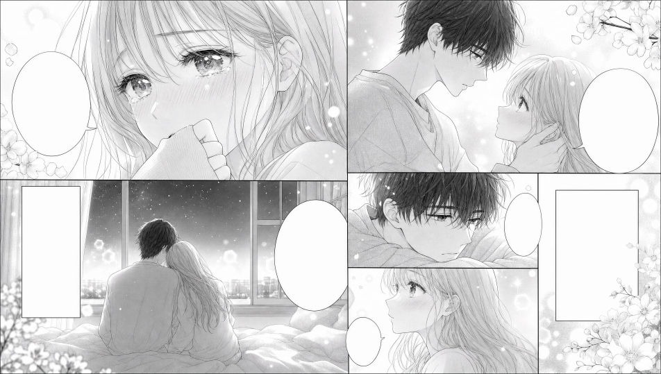
Draft 3: The three turns appear as beats 1, 2, and 3 in your chosen reading direction. The balloon has room around its text, B's expression is visible, and the tail points to B.
On r/ComicBookCollabs, a letterer reviewing sample work wrote, “You did a great job placing the dialogue balloons compositionally. However, in many places the words and letters are almost touching the edges of the speech bubbles.”
When every word matters, split the speech across two natural beats to keep its full meaning. Move the balloon to protect essential artwork. If neither leaves a clear reading path, recompose the panel.
Keep lettering editable until the page is ready to Export
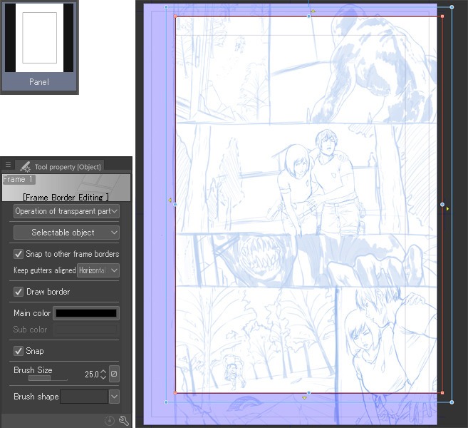
Digital lettering is easier to revise when artwork, balloons, and text stay editable in the working file. A flattened image works for delivery as long as you keep a layered master for corrections.
The Clip Studio Paint Balloon manual documents balloon creation, tail editing, and balloon layers.
Clip Studio Paint DEBUT does not include the Balloon tool.
MediBang's Android manga tutorial covers text editing and the effect of rasterization. Rasterization turns editable material into pixels, so later changes to dialogue mean reconstructing text that was once editable.
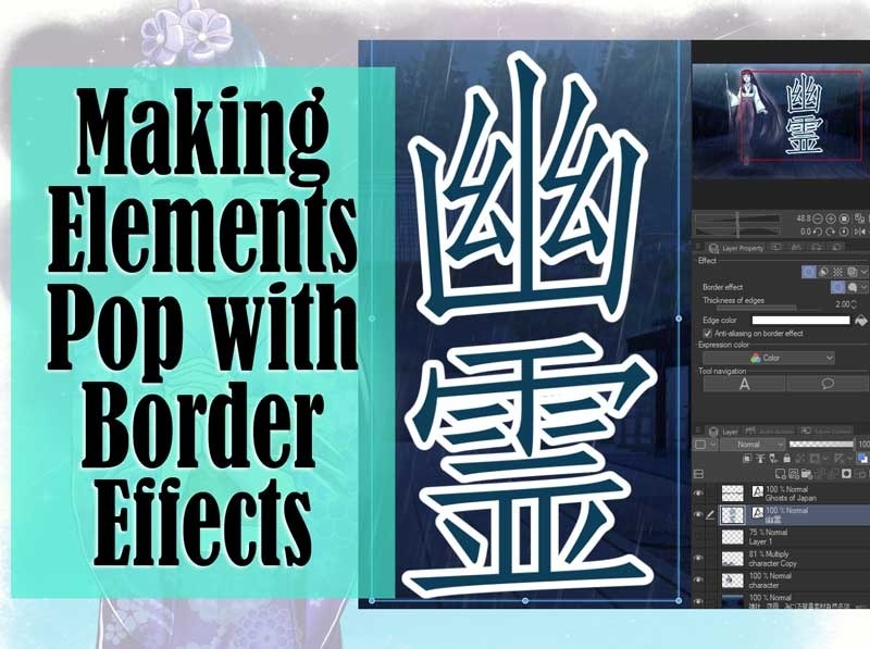
Keep an editable master with the original art separated from lettering, plus a clean-art variant for when a collaborator or edition needs a textless page.
English localization has its own space problem: horizontal English lines sometimes need to fit balloons composed for vertical Japanese text.
Font permissions depend on the license and intended use. Blambot's licensing information distinguishes qualifying indie-comic uses from other permissions, and a free download doesn't grant unrestricted publishing rights. Record the font you used and read its terms before distribution.
Proof the lettering at the size readers will actually see
Proof the exported page in the form readers will use. Zooming in on screen can hide small lettering, uneven spacing, or a balloon that sits awkwardly against the artwork.
For print, use the physical page size. For digital delivery, look at the display size, including a phone-sized view when that's how readers will see the page. Follow any publisher or collaborator output specifications.
| Check | Pass condition |
|---|---|
| Dialogue order | Reader follows the sequence without backtracking |
| Speaker identity | Each line clearly belongs to its speaker, unless the ambiguity is deliberate |
| Ordinary type | Dialogue stays comfortably legible at final size |
| Interior spacing | Letters have room, and line breaks look deliberate |
| Artwork visibility | Faces, gestures, and narrative action stay visible |
| Visual emphasis | Any change in lettering style marks a deliberate difference in voice |
| Export integrity | The exported page matches the working file |