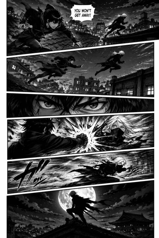
The best layout takes readers through your story beats in the order you planned. Group panels simply by default. Switch to a more expressive arrangement only when it strengthens a moment without confusing the route. Sketch the balloons, let someone who hasn't seen the page follow it with no hints, and fix any transition they stumble on before you ink.
A manga page can contain beautiful drawings and still be hard to read. A tall frame sends the eye down when the next event is across the page. A balloon hides the one object that matters. And an imposing final panel shows the visitor before the character hears a voice.
This guide uses one fictional scene throughout: a character enters a quiet station, notices a key on the floor, hears an unseen voice, turns, and recognizes an unexpected visitor. The events stay the same. Their placement changes what the reader notices and when.
Choose the reading direction before you arrange panels
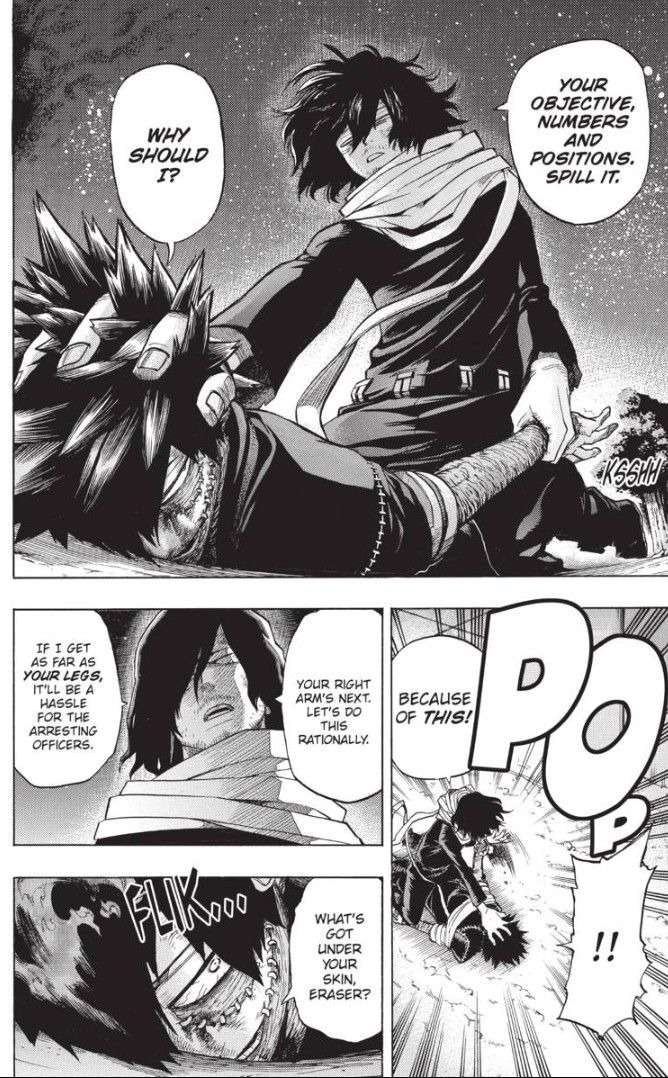
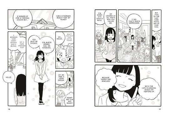
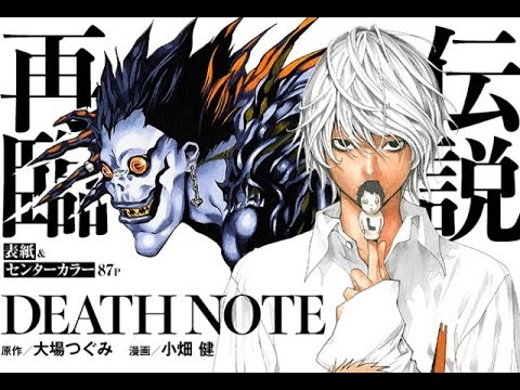
Traditional Japanese manga reads from right to left, including the order of panels and speech balloons. An original comic deliberately designed for left-to-right English reading works too, as long as every page keeps that direction.
The Ohio State University Library covers the right-to-left convention in its manga teaching materials. On a conventional right-to-left page, the upper-right panel starts the sequence. Readers follow the planned grouping across, then drop to the next tier below.
A five-panel station page shows it. In the first tier, panel 1 on the right shows the station entrance and panel 2 on the left shows the key. In the second tier, panel 3 on the right contains the unseen voice and panel 4 on the left shows the character turning. Panel 5 sits alone at the bottom, revealing who spoke.
Turn story beats into a workable number of panels
Panel count comes from what the scene needs the reader to notice. In a r/ComicBookCollabs discussion about panels per page, a writer adapting prose into a black-and-white comic set out a limit: “I have been trying to get my panels down to 3-5 per page max (with a few specific exceptions, mostly as insets) for a comic done exclusivley in black and white.”
That's one writer's limit. Density depends on lettering: a few heavily lettered frames can be denser than several small, nearly wordless ones.
Aim for one story change per panel. A panel can hold a setting, background figures, and simultaneous motion, but the reader should see at once what it adds. The key's discovery and the reaction to a voice are different changes. Put both in one busy image and readers lose the order.
- Split a beat when two actions follow each other or two things compete for focus.
- Combine beats when several frames show the same action with no pause and no new information.
- Keep the sequence when every frame adds something and leaves room for art and dialogue.
Label the new information or change in each proposed frame. An extra close-up of the character still looking at the key earns its place only if that hesitation changes the scene.
Make rows, gutters, and staggered panels point the right way
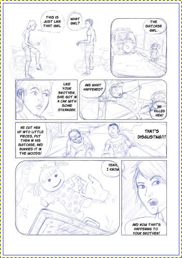
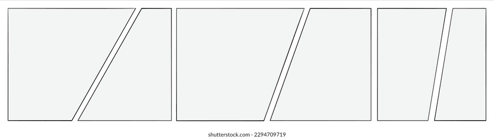
Gutters are the spaces between panels. Tiers and larger blocks group those panels into a route the reader recognizes before studying each drawing. The CLIP STUDIO TIPS tutorial on DANGUMI describes one method: divide the page into major blocks, then split those blocks into individual frames.
A simple right-to-left page has two panels above two more. Call the top-right panel A, top-left B, bottom-right C, and bottom-left D. The planned order is A, B, C, D. If the vertical gap between A and B lines up exactly with the vertical gap between C and D, all four corners meet in one cross-shaped junction. From A, the page appears to offer both a route left to B and a route down to C.
Now move the lower pair's dividing line sideways and keep the horizontal gutter between tiers continuous. The upper vertical gap ends at that horizontal divider and forms a T-shaped junction, so the four-way crossing disappears. Rachel Thorn's T Rule covers staggered borders and manga-page reading paths.
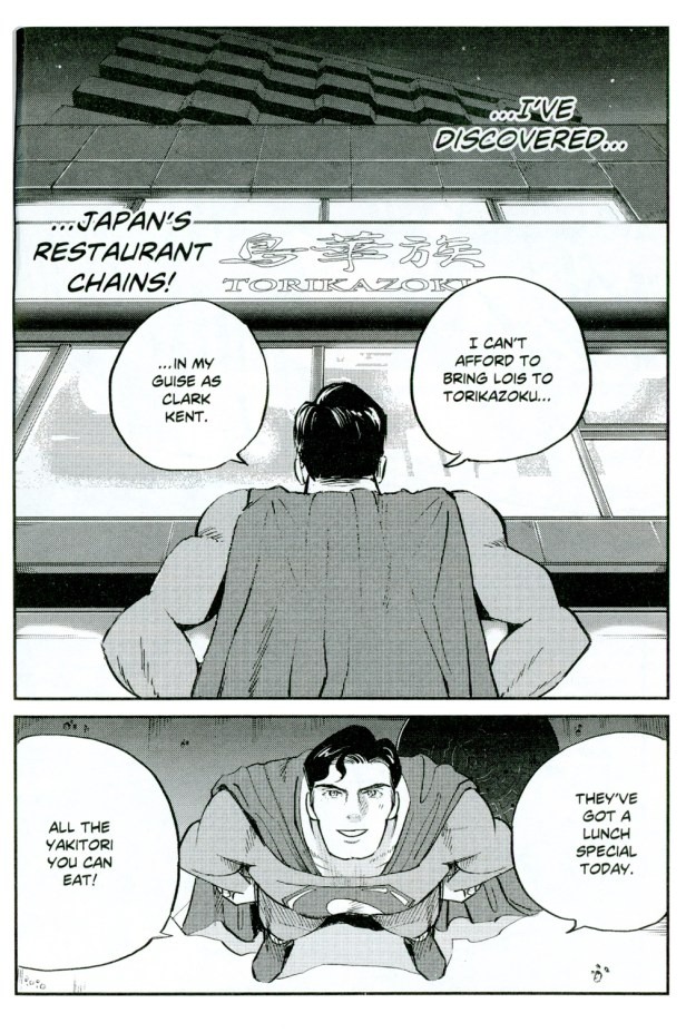
Tall blocking panels need the same scrutiny. When A and B are stacked at the right and C is one tall panel at the left, the layout suggests A to B to C even when you planned to cross from A to C before descending to B. The tall frame and the unbroken gutters give the reader two possible routes.
In a 2013 study by Neil Cohn in Frontiers in Psychology, 145 volunteers, recruited at Comic-Con International in San Diego in 2004, numbered the perceived reading order of 12 layouts containing empty comic panels. In one blocking condition, 91 chose a vertical continuation and 40 chose the horizontally adjacent alternative. Cohn's later figure-caption correction identifies the relevant blocking panel as vertical.
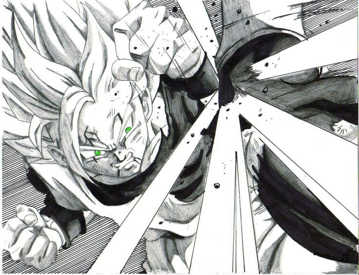
Gutter width can strengthen or weaken the impression that frames belong together. On your rough page, find the cross-shaped junctions, tier boundaries, and tall panels. At each one, ask whether a reader could go the wrong way.
Size and frame the moments that need emphasis
Larger panels give visual prominence and room for a setting, action, reaction, or reveal. Smaller panels separate brief movements and exchanges.
Shot scale offers a second choice. A wide view can establish the station corridor, a medium shot can preserve the character's position as they turn, and a close-up can isolate the key or a change of expression. MediBang's manga-layout teaching distinguishes ordinary scenes, battle sequences, and explanatory passages, since each asks the page to carry different information.
| Layout choice | Useful when | Trade-off |
|---|---|---|
| Regular tiers | A conversation needs a steady exchange | Less dramatic variation |
| Large panel | A reveal, reaction, or setting deserves prominence | Can expose the image too early |
| Several small panels | Brief actions need distinct beats | Less room for text and figures |
| Close-up | A key object or expression carries the change | Less surrounding geography is visible |
| Staggered group | Emphasis justifies an irregular route | Border grouping needs more care |
A quiet conversation benefits from stable character positions and enough text space. An action scene needs room to show a movement's direction, or a run of short frames to separate its stages. A withheld revelation needs the reader to meet the important image at the chosen moment.
For the station scene, the key can get a close-up while the visitor gets a larger final panel. Another version gives that space to the character's reaction, shifting the emotional center without changing the story.
A page-turn reveal only works if the next page stays hidden until the turn. In a printed book, facing pages are visible together.
Make dialogue fit before you lock the layout
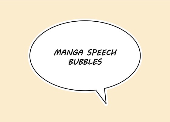
Dialogue takes up drawing space and changes the route through a page. A clean arrangement of empty panels gets crowded once the actual words appear.
One creator in a r/ComicBookCollabs discussion of visual pacing wrote: “Small caveat: panel counts stay provisional until the dialogue is lettered, because balloon space can wreck a clean outline.”
In the station scene, the unseen voice says, “Wait.” Its balloon needs a position that signals a voice outside the visible frame. If the balloon from panel 3 spills across the junction into the earlier key panel, it hides the clue. If it pulls the eye there too soon, the voice arrives before the discovery.
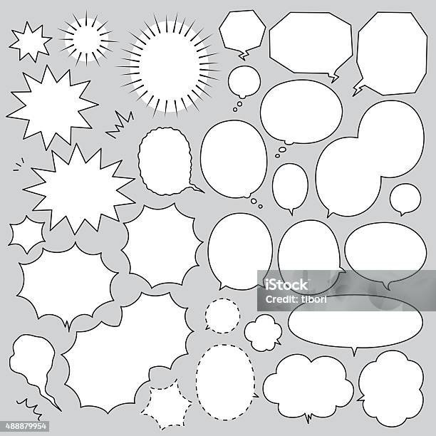
Add rough words and balloon silhouettes to the thumbnail. Where they cover the main artwork or interrupt the sequence, shift the composition, simplify the line, or give the panel more room. Judge the lettering at the size readers will view it.
Guide the eye with composition, gestures, and Continuity
Faces, hands, movement, and strong contrast can pull attention across otherwise orderly panel borders. A commenter in a r/MangakaStudio page critique wrote, “You are directing the readers eyes into the panel with the hand.”
In the station scene, a pointing arm draws attention left while the next panel lies below on the right. A changed pose or stronger contrast on the main subject clarifies the transition.
Trace the strongest gaze and motion lines on a rough page to see whether they support your planned route.
See the same manga scene in two different layouts
The five station beats fit onto two clear pages that weight them differently. Both use right-to-left reading order, with the same dialogue and events.
Layout A: an orderly discovery
Use the five-panel page from the first section as three horizontal tiers of similar height, with panel 5 as a single full-width panel showing the visitor.
The similar tier heights leave room for a steady progression. The visitor completes the sequence without overwhelming the earlier discovery or reaction.
Layout B: the visitor takes the page
Keep the five beats and their order, and keep panels 1 to 4 in their positions, but compress the top two tiers vertically. Give panel 5 the lower portion of the page, roughly half of the available drawing area, so the visitor becomes its dominant image.
The compressed middle tier gives the voice and turn less space, including less room for the word balloon and body movement. If the big visitor image extends upward beside those panels, it catches the reader before the voice and reaction. A continuous separator above the reveal keeps its entry point distinct.
| Decision | Layout A: even tiers | Layout B: large reveal |
|---|---|---|
| Reading path | Two panels, two panels, one panel | Same order with compressed middle tier |
| Focal moment | Attention shared across the scene | Visitor dominates the lower page |
| Dialogue room | Middle panels have regular height | Voice and turn panels have less space |
| Continuity | Separate views show each change | Large visitor image can show more surroundings |
| Reveal timing | Visitor follows a clear tier break | Oversized image needs a separator above it |
A restrained, unsettling discovery favors Layout A. If the visitor's identity is the scene's emotional peak, Layout B gives it more emphasis, as long as the smaller supporting panels stay legible.
Fix the layout mistakes that Make pages feel crowded or confusing
A crowded manga page has a navigation problem, a text-space problem, or a visual hierarchy problem.
If the station floor is crowded with signs, tiles, heavy tones, and scattered objects, the key that drives the next event disappears into the background. Simplify the local detail or change its contrast to give that object a clear place in the image.
| Visible symptom | Cause |
|---|---|
| Two possible next panels | Cross-shaped gutter or competing group boundary |
| Reader descends too soon | Tall block suggests a vertical continuation |
| Main object gets lost | Dense detail competes with the object |
| Balloon covers meaningful action | Text and artwork need the same space |
| Movement points toward the wrong frame | Gesture competes with panel sequence |
Dense textures and irregular borders work as long as the key information and the reading route stay clear. Changing every border and removing every background detail flattens the expressive effect that made the page interesting.
Test the reading path before you ink the page
An unassisted reading check shows where your planned sequence and another person's order disagree. Show an unfamiliar reader a rough page with enough artwork and rough balloons to represent the real scene, and leave off guide arrows and planning numbers.
Ask them to mark the order they read the panels and where they hesitated. Compare their sequence with yours and find the first point where the two orders split. On the station page, an early jump to the visitor points to the oversized reveal, a border junction, or a strong direction cue.
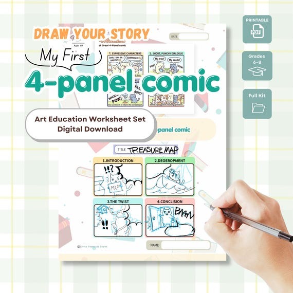
| Worksheet field | What to record |
|---|---|
| Planned order | Your planned panel sequence |
| Reported order | Reader's actual sequence |
| First divergence | Transition where the paths differ |
| Possible cause | Grouping, gesture, balloon, or reveal |
Make the smallest change at the uncertain transition, then repeat the exercise if the page is still hard to follow.